Home » Economy (Page 5)
Category Archives: Economy
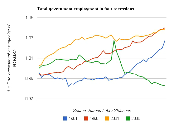
Government Jobs Not Rebounding As In Past Recessions

Public-sector austerity in one graph
On Friday, I ran some numbers on public-sector employment: Since Obama was elected, the public sector has lost about 600,000 jobs. If you put those jobs back, the unemployment rate would be 7.8 percent. [SNIP]
Today, Ben Polak, chairman of the economics department at Yale University, and Peter K. Schott, professor of economics at the Yale School of Management, widen the lens, with similar results: There is something historically different about this recession and its aftermath: in the past, local government employment has been almost recession-proof. This time it’s not. [SNIP] Go to like to read the rest of Ezra Klein’s article. Thank you.
A Flat Tax Payroll Deduction Might Save Social Security
DATA DRIVEN POINT OF VIEW: Don’t be fooled. Discussions about raising or lowering Federal Income Taxes has little to do with Social Security and Medicare, which are separately funded by payroll deductions. Is there a funding crisis for Social Security and Medicare? A long term problem, yes. A crisis, no. Can America continue to afford these programs given the number of baby boomer retirements? The answer is yes, of course we can. We are the wealthiest county on Earth. Nations with far less wealthier already provide their citizens with much more generous benefits. The reason we feel the funding punch is that the structure we’ve enacted to pay for federal insurance benefits is so regressive.
We could institute a flat tax for Social Security and Medicare. The table below shows what this might generate in premiums at the current 7.65% rate of payroll deductions. This plan would clearly generate more revenue than needed for current benefits. A flat payroll tax of significantly less than the current 7.65% would be all that is needed to fully fund Social Security and Medicare. It would reduce payroll taxes for the majority of Americans.
|
Payroll Taxes for Social Security and Medicare
|
||||
|
Total Income from Wages
|
Amount Currently Deducted
|
Contribution As a % of Income
|
Contribution if deductions were based on a flat tax
|
|
|
$1,000
|
$77
|
7.65%
|
$77
|
This Segment Represents 57 million households
|
|
$10,000
|
$765
|
7.65%
|
$765
|
|
|
$50,000
|
$3,825
|
7.65%
|
$3,825
|
|
|
$100,000
|
$7,650
|
7.65%
|
$7,650
|
|
|
$500,000
|
$8,423
|
1.68%
|
$38,250
|
|
|
$1,000,000
|
$8,423
|
0.84%
|
$76,500
|
There are at least 100,000 household in this segment
|
|
$10,000,000
|
$8,423
|
0.084%
|
$765,000
|
|
|
$50,000,000
|
$8,423
|
0.017%
|
$3,825,000
|
|
|
$100,000,000
|
$8,423
|
0.0084%
|
$7,650,000
|
|
|
$500,000,000
|
$8,423
|
0.0017%
|
$38,250,000
|
|
|
$1,000,000,000
|
$8,423
|
0.00084%
|
$76,500,000
|
|
|
$10,000,000,000
|
$8,423
|
0.000084%
|
$765,000,000
|
|
This table assumes that income from wages for the wealthy are at least $110,100, which is the income cap for 2012, and assumes they are not self-employed. Income from investments are not subject to payroll deductions. Employers pay an additional 7.65% in payroll taxes for their employees. The self employed also pay corresponding more in payroll taxes for their Social Security and Medicare benefits. Additional payroll deductions for unemployment and disability insurance may also apply in certain states and with certain individual.
These programs exist for everyone, and everyone should contribute according to their means. Those who are fortunate enough not to need the benefits still have a moral obligation to assure a minimal level of care to those less fortunate, and a social obligation to contributed to those who gave a lifetime of labor creating the fabulous wealth that the wealthy have accumulated.
Our Long-term Debt Will Be Fixed If Congress Does Nothing – But Don’t Count On that!
According to the Congressional Budget Office information (see below), it appears that if the “do-nothing” Congress actually does nothing the nation’s long term debt outlook would significantly improve. As it stands, temporary tax cuts are set to expire and automatic budget cuts already passed by Congress with bi-partisan support are set to take effect. As a result of laws already on the books our long-term debt problem is about to be fixed. But Congress will have none of this! Nor should they!
The 2012 Long-Term Budget Outlook: Infographic

Do Business Friendly Policies Reduce Poverty?
Do Business Friendly Policies Reduce Poverty?. A look at the numbers.
Wealth Redistribution Begins with A Fair Wage
When America’s wealthy elite talk of the redistribution of wealth it is a derisive term applied to federal aid to the working poor paid out of federal tax revenues. The rich are unhappy that some of their compensation goes to support low wage earners. But the growing need for federal aid to support working families is really a consequence of the unfair redistribution of wealth that takes place every working day.
Beginning around 1978 and continuing today, hourly employees have not received a fair wage for a days work. More specifically, hourly wages stopped keeping pace with the rise of hourly productivity (or GDP). Workers continued generating new wealth but they were no longer receiving a share in the additional wealthy they were creating. This simple fact, compounded over the decades, is the single most relevant factor behind our economic difficulties today. Below are some key findings from a report regarding how America’s wage earners are doing. It is from a report put out by the Economic Policy Institute.
THE STATE OF WORKINGAMERICA
Policy-driven inequality blocks growth for low- and middle-income Americans
http://stateofworkingamerica.org/fact-sheets/key-findings/
Daily stock indices, monthly employment reports, and even quarterly data on the gross domestic product are insufficient indicators for answering this vital question:
How well is the American economy providing acceptable growth in living standards for most households?
EPI’s The State of Working America, 12th Edition looks broadly at available data and concludes that the answer is simply “not well at all.”
This is not because the economy has failed to grow, on average. National income has grown enough to substantially improve the fortunes for all. As the data reveal, however, it is the top 5%, the top 1%, and fractions of the top 1 percent that have received almost all the benefits of the economy’s growth.
America’s low- and middle-income families have suffered a lost decade
22% – Despite an increase in productivity of more than 22 percent [between 2000 and] 2010, typical wage earners made roughly the same amount per hour as in 2000.
↓ 6% – Median family income was 6 percent lower in 2010 than in 2000.
This lost decade of no wage and income growth began well before the Great Recession—which started in Dec. 2007—battered wages and incomes. In the historically weak economic expansion following the 2001 recession, hourly wages and compensation failed to grow for either high school– or college-educated workers.
Another lost decade ahead?
Consensus forecasts predict that unemployment will remain high for many more years, suggesting that typical Americans are in for another lost decade of living standards growth. For example, as a result of persistent high unemployment, the incomes of families in the middle fifth of the income distribution in 2018 will likely still be below 2000 levels.
A generation of rising inequality.
156% – From 1979–2007, wages for the top 1 percent of wage earners grew 156 percent, compared to 17 percent for the bottom 90 percent.
60% – From 1979–2007, the top 1 percent of tax units claimed 60 percent of the cash, market-based income growth, compared to 9 percent for the bottom 90 percent.
38.3% – From 1983–2010, 38.3 percent of the wealth growth went to the top 1 percent and 74.2 percent to the top 5 percent. The bottom 60 percent, meanwhile, suffered a decline in wealth.
Rising inequality prevented wage growth for low- and middle-income workers
0.6% – From 1979–2007, incomes for the middle fifth of households grew, but the annualized rate of growth (0.6 percent) reflects a deep economic failure. This middle-fifth growth lagged far behind average growth over the same period, and pales in comparison to growth during earlier periods of history; between 1947 and 1979, for example, cash incomes (not even including expanded employer-provided and government in-kind benefits like health care) for the middle fifth of American families grew at an average annual rate of 2.4 percent—or four times as fast as what was achieved by the middle fifth of households between 1979 and 2007. If the middle fifth of the income distribution had grown at the average rate of income growth overall, these households would have had income $18,897 higher in 2007.
7% – The typical worker has not gained from improvements in the ability to produce more goods and services per hour worked (productivity growth). Between 1979 and 2011, productivity grew 69 percent, but median hourly compensation (wages and benefits) grew just 7 percent.
Policy choices generated inequality
Policy decisions made over the last several decades have caused this explosive rise in inequality. These decisions include: lowering individual and corporate tax rates; deregulating industries; failing to maintain the value of the minimum wage; failing to protect the right of workers to obtain collective bargaining; and failing to prevent asset bubbles.
Additional findings.
These sobering data could be mitigated by the ability of Americans to move freely up and down the income or wealth ladders (mobility). There is no evidence, however, that mobility has increased to offset rising inequality.
Further examination of the data through the lenses of race and ethnicity finds the overall data obscure the dramatically worse outcomes minorities face.
Gender gaps have been reduced in many of our labor market analyses. While due in large part to substantial gains for women, part of the closing of the gap has occurred because men have lost significant ground.
U.S. Drops to 12th Place on Global Prosperity and Well Being Index
How prosperous is the United States compared with other nations? The latest Prosperity Index is out, and the news for America is disappointing. The U.S. fell to 12th place in the world, just behind Luxembourg and Ireland. Partisan and ideologically driven arguments should to be set aside for the moment as we analyze and assess this data. We should take this finding as a challenge to be solved by appealing to our strengths as a nation. In the coming months I will be exploring various aspects effecting our national prosperity. I invite the readers of this blog to check back periodically to see what I uncover.
The 2012 Legatum Global Prosperity Index of Wealth and Well Being
The just released Global Prosperity Index finds the United States has fallen to 12th place in the world. This is the first time the US has not been in the top 10 group. The Index is based on the Dubai-based Legatum Institute’s assessment of prosperity based on both material wealth and personal wellbeing in 142 different countries, in eight categories ranging from the economy and entrepreneurship to health and personal freedom. The top 25 nations ranking is as follows:
Prosperity Index
1 – Norway
2 – Denmark
3 – Sweden
4 – Australia
5 – New Zealand
6 – Canada
7 – Finland
8 – Netherlands
9 – Switzerland
10 – Ireland
11 – Luxembourg
12 – U.S.
13 – UK
14 – Germany
15 – Iceland
16 – Austria
17 – Belgium
18 – Hong Kong
19 – Singapore
20 – Taiwan
21 – France
22 – Japan
23 – Spain
24 – Slovenia
25 – Malta
There are eight categores by which national prosperity is judged. The United States scored as follows on these eight categories:
Ranking Catigory
20 Economy
12 Entrepreneurship /Opportunity
10 Governance
5 Education
2 Health
27 Safety/Security
14 Personal Freedom
10 Social Capital
Half of All Full-time Employees Earn Less Than $19/hr.
Bureau of Labor Statistics
For release 10:00 a.m. (EDT) Thursday, October 18, 2012 USDL-12-2072
Technical information: (202) 691-6378 • cpsinfo@bls.gov • www.bls.gov/cps
Media contact: (202) 691-5902 • PressOffice@bls.gov
USUAL WEEKLY EARNINGS OF WAGE AND SALARY WORKERS THIRD QUARTER 2012
Median weekly earnings of the nation’s 103.6 million full-time wage and salary workers were $758 in the third quarter of 2012 (not seasonally adjusted), the U.S. Bureau of Labor Statistics reported today.
This was 0.7 percent higher than a year earlier, compared with a gain of 1.7 percent in the Consumer Price Index for All Urban Consumers (CPI-U) over the same period.
Data on usual weekly earnings are collected as part of the Current Population Survey, a nationwide sample survey of households in which respondents are asked, among other things, how much each wage and salary worker usually earns. (See the Technical Note.) Data shown in this release are not seasonally adjusted unless otherwise specified. Highlights from the third-quarter data are:
- Seasonally adjusted median weekly earnings were $765 in the third quarter of 2012, little changed from the previous quarter ($773). (See table 1.)
- On a not seasonally adjusted basis, median weekly earnings were $758 in the third quarter of 2012. Women who usually worked full time had median weekly earnings of $685, or 82.7 percent of the $828 median for men. (See table 2.)
- The female-to-male earnings ratio varied by race and ethnicity. White women earned 83.4 percent as much as their male counterparts, compared with black (93.2 percent), Hispanic (87.5 percent), and Asian women (73.1 percent). (See table 2.)
- Among the major race and ethnicity groups, median weekly earnings for black men working at full-time jobs were $633 per week, or 74.1 percent of the median for white men ($854). The difference was less among women, as black women’s median earnings ($590) were 82.9 percent of those for white women ($712). Overall, median earnings of Hispanics who worked full time ($556) were lower than those of blacks ($606), whites ($780), and Asians ($915). (See table 2.)
- Usual weekly earnings of full-time workers varied by age. Among men, those age 45 to 54 and 55 to 64 had the highest median weekly earnings, $976 and $980, respectively. Usual weekly earnings were highest for women age 35 to 64; weekly earnings were $740 for women age 35 to 44, $754 for women age 45 to 54, and $766 for women age 55 to 64. Workers age 16 to 24 had the lowest median weekly earnings, at $437. (See table 3.)
- Among the major occupational groups, persons employed full time in management, professional, and related occupations had the highest median weekly earnings—$1,300 for men and $948 for women. Men and women employed in service jobs earned the least, $530 and $440, respectively. (See table 4.)
- By educational attainment, full-time workers age 25 and over without a high school diploma had median weekly earnings of $464, compared with $648 for high school graduates (no college) and $1,170 for those holding at least a bachelor’s degree. Among college graduates with advanced degrees (professional or master’s degree and above), the highest earning 10 percent of male workers made $3,448 or more per week, compared with $2,311 or more for their female counterparts. (See table 5.)
Revision of Seasonally Adjusted Usual Weekly Earnings Data The Usual Weekly Earnings news release for the fourth quarter of 2012 will incorporate annual revisions to seasonally adjusted data for the number of full-time wage and salary workers and median weekly earnings in current dollars. (See table 1.) Estimates for constant (1982-84) dollar median weekly earnings also will be affected by revisions to the current dollar series. Seasonally adjusted estimates back to the first quarter of 2008 will be subject to revision.
Go to Tables: http://www.bls.gov/news.release/pdf/wkyeng.pdf
Fiscal Cliff’s Specific Tax Breaks About to Expire
Tax Relief, Unemployment Insurance Reauthorization, and Job Creation Act of 2010
From Wikipedia, the free encyclopedia
Key aspects of the law include:
§ Extending the EGTRRA 2001 income tax rates for two years. Associated changes in itemized deduction and personal exemption rules are also continued for the same period. The total negative revenue impact of this was estimated at $186 billion.[7]
§ Extending the EGTRRA 2001 and JGTRRA 2003 dividends and capital gains rates for two years. The total negative revenue impact of this was estimated at $53 billion.[7]
§ Patching the Alternative Minimum Tax to ensure an additional 21 million households will not face a tax increase. This was done by increasing the exemption amount and making other targeted changes. The negative revenue impact of this measure was estimated at $136 billion.[7]
§ The above three measures are intended to provide relief to more than 100 million middle-class families and prevent an annual tax increase of over $2,000 for the typical family.[8]
§ A 13-month extension of federal unemployment benefits.[2][9] The cost of this measure was estimated at $56 billion.[7]
§ A temporary, one-year reduction in the FICA payroll tax. The normal employee rate of 6.2 percent is reduced to 4.2 percent. The rate for self-employed individuals is reduced from 12.4 percent to 10.4 percent.[9] The negative revenue impact of this measure was estimated at $111 billion.[7]
§ Extension of the Child Tax Credit refundability threshold established by EGTRRA, ARRA, and other measures.[7] According to the White House, this would benefit 10.5 million lower-income families with 18 million children.[2]
§ Extension of ARRA’s treatment of the Earned Income Tax Credit for two years.[7] According to the White House, this would benefit 6.5 million working parents with 15 million children.[2]
§ Extension of ARRA’s American opportunity tax credit for two years, including extension of income limits applied thereto.[7] According to the White House, this would benefit more than 8 million students and their families.[2]
§ The above three provisions, as well as some other similar ones, are intended to provide about $40 billion in tax relief for the hardest-hit families and students.[8]
§ An extension of the Small Business Jobs and Credit Act of 2010‘s “bonus depreciation” allowance through the end of 2011, and an increase in that amount from that act’s 50 percent to a full 100 percent. For the year of 2012, it returns to 50 percent.[9] The White House hopes the 100 percent expensing change will result in $50 billion in new investments, thus fueling job creation.[2]
§ An extension of Section 179 depreciation deduction maximum amounts and phase-out thresholds through 2012.[9]
§ Together, the above two business incentive measures were estimated to have a negative revenue impact of $21 billion.[7]
§ Various business tax credits for alternative fuels, such as the Volumetric Ethanol Excise Tax Credit, were also extended.[10] Others extended were credits for biodiesel and renewable diesel, refined coal, manufacture of energy-efficient homes, and properties featuring refueling for alternate vehicles.[9] Also finding an extension was the popular domestic Nonbusiness Energy Property Tax Credit, but with some limitations.[7]
§ Estate tax adjustment. EGTRRA had gradually reduced estate tax rates until there was none in 2010. After sunsetting, the Clinton-era rate of 55 percent with a $1 million exclusion was due to return for 2011. The compromise package sets for two years a rate of 35 percent with an exclusion amount of $5 million. The negative revenue impact of this provision was estimated at $68 billion.[7][11]
§ An extension of the 45G short line tax credit, also known as the Railroad Track Maintenance Tax Credit, through January 1, 2012. This credit had been in place since December 31, 2004 and allowed small railroad companies to deduct up to 50% of investments made in track repair and other qualifying infrastructure investments.[12]
2. ^ a b c d e f “Tax Cuts, Unemployment Insurance and Jobs”. The White House. Retrieved December 17, 2010.
7. ^ a b c d e f g h i j k “Tax Cut Extension Bill Wends Its Way to White House”. Accounting Today. December 17, 2010. Retrieved December 17, 2010.
8. ^ a b “Fact Sheet on the Framework Agreement on Middle Class Tax Cuts and Unemployment Insurance |”. The White House. December 7, 2010. Retrieved December 10, 2010.
9 ^ a b c d e Dupree, Jamie (December 9, 2010). “Tax Cuts Compromise Package Summary”. The Atlanta Journal-Constitution. Retrieved December 10, 2010.
U.S. Global Business Competitiveness Slipping
The World Economic Forum published a study on global business competitiveness that ranks 144 nations according to indicators in 12 categories. We American’s sometimes inflate our greatness among nations. With respect to our Militarily this is justified. The United States represent nearly half of the worlds total military capability. But on measures of national well being, ecology, human rights, health care, press freedom and many other critical areas we often fall short in comparison to other advanced nations.
Given how highly our politics regards U.S. business interests, you might assume our global business competitiveness makes us number one in the world. Keep in mind as you read on that many of the specific measures that make businesses competitive are not in the best interest of ordinary citizens. Business interests and social interests are sometime opposed.
The business competitiveness study categories and where the United States ranks:
CATIGORY RANK (Out of 144)
| 1. Institutions | 42 |
| 2. Infrastructure | 14 |
| 3. Macroeconomic Environment | 111 |
| 4. Health and Primary Education | 34 |
| 5. Higher Education and Training | 8 |
| 6. Goods Market Efficiency | 23 |
| 7. Labor Market Efficiency | 6 |
| 8. Financial Market Development | 16 |
| 9. Technological Readiness | 11 |
| 10. Market Size | 1 |
| 11. Business Sophistication | 10 |
| 12. Innovation | 6 |
Overall, the United States is very competitive, ranking 7th out of 144 nations. This is a decline from last year, however, when we were 5th out of 142 countries. Major reasons for the overall low marks can be found in our Macroeconomic situation, primarily our government budge imbalance and huge national debt on which we were ranked 140th and 136th respectively . Our gross national savings is also very low, with a rank of 114th in the world. Still, confidence in America’s credit rating remains high, 89.4%, or 11th among the nations.
Looking at our strengths and weaknesses, in the Institutions category our top ranking was 5th in investor protections. Our next highest rankings were in efficiency of corporate boards (23rd), intellectual property protection and ethical behavior of firms (both ranked 29th). Our lowest ranking was on the business cost of terrorism (124th). Next lowest rankings were in the business cost of crime and violence, and the business cost of organized crime (86th and 87th).
We did better in Infrastructure. We ranked 1st in available airline seats and 15th in telephone land lines. Interestingly, mobile phone subscriptions were our lowest indicator (72nd) followed by the quality of our electric supply (33rd in the world). Our transportation infrastructure didn’t fair much better (30th).
In the category of Health and Primary Education we had no malaria impact on businesses (1st) but the prevalence and business impact of HIV was high ranking the US 92nd and 90th in the world. Also surprising was our low ranking on primary school enrollments (58th), infant mortality (41st) and the quality of our primary education (38th).
In Higher Education and Training we are doing well in post-secondary education (2nd) and the availability of research and training opportunities (9th). We ranked 47th in secondary school enrollment and the quality of our math and science education.
In Goods and Market Efficiency we rank 9 and 10 in market dominance and buyer sophistication. Our worst ranking is on the business tax rate to profit ration (103rd).
In the area of Labor Efficiency we apparently have the lowest labor redundancy costs in the world (1st) and our hiring and firing practices are also great for business (8th). The labor redundancy variable estimates the cost of advance notice requirements, severance payments, and penalties due when terminating a redundant worker. We also ranked 5th in the brain drain measure and 8th in the efficiency of our hiring and firing practices. Our low rankings here were in the women to men ratio in the work force (we ranked 44th) and our cooperation in labor-employer relations (42nd) , perhaps no surprise give our ease and thrift in firing people).
In the Financial Market Development category we are very competitive in the availability of venture capital (10th) but weak on the strength of our banking institutions (80th). Regarding the regulation of security and exchange, we also ranked low (39th) although it is unclear if this means we are over or under regulated.
In the area of Technological Readiness we ranked 8th in the number of internet subscribers yet 20th in the percentage of individuals using the internet. We rank lowest, (43rd) on foreign direct investment and technology transfer.
Market Size, we remain number one in domestic market size (we buy more things) and number two in foreign market size.
In the category of Business Sophistication we are third in the extent of marketing and ranked in the low teens on other measures, such as production process (13th) and local supplier quality/quantity (14th).
When it comes to Innovation, The United States is still doing very well. We are ranked in the single digits on most measures, including University-industry collaboration in R&D (3rd), Availability of scientists and engineers (5th), Quality of scientific research institutions (6th), Capacity for innovation and Availability of scientists and engineers (both ranked 7th). Our lowest ranking in this area was in government procurement of advanced tech products (15th).
Read more at: http://reports.weforum.org/global-competitiveness-report-2012-2013/
Graphic View of Wealth Distribution in America
Who Owns What In America?
Imagine lining up everyone in America according to what they own, starting with those who own nothing and continuing down the line to those who own a lot. Now divide that line of people into five equally long segments. Each segment would include 20% of the total population, or about 61.7 million people. Next, add up the total amount of what everyone owns in each segment. The result is represented by the pie chart below. The whole pie represents the total wealth in America. The size of each slice represent the ratio of how much each segment owns of America’s wealth. The slice of ownership for the poor and working poor are barely visible. 80% of all Americans own just 15.6% of America’s wealth.
The number of people who slipped into poverty in 2010 is an all time high of 46.2 million, so the poorest 20% in terms of wealth ownership includes 15.5 million folks who technically don’t meet the poverty criteria, based on income levels. The poor essentially own almost nothing. The working poor own twice of almost nothing.

When I first plotted the distribution of wealth in America in this pie chart it reminded me a little of that Pac-Man character. The richest Americans own 84.6% of everything while the remaining 80% of us have 15.4% left. The statistical middle of what I labeled the “Middle America” owns just 4% of America’s wealth assets.
This raises an interest question. How do we define middle class? Is Middle America, as I’ve labeled it here the same as middle-class?
No, We usually define middle class by income levels, not wealth ownership. As of 2011 the median family income has declined to just over $51,000 per year. If we were to define middle class based on 10% of families above and below the median income (as I have done here for wealth ownership, the narrow and very low income range would not fit most peoples conception of “middle class”.
But this pie chart displays the distribution of wealth, not income. It includes all equity ownership in everything from homes to 401K’s, stocks, bonds, businesses, etc. This chart cannot be directly converted to income levels. There are people with equity but not much income and people with large incomes but not much equity.
However, from a visual perspective the median income (middle most income) will still fall somewhere near the center of the red colored slice, about where the label line is drawn. Individuals in that group made about $26,364 per year, or about $52,000 per household in 2010. Beyond that it is difficult to superimpose income brackets on this pie chart
This graphic really make clear just how compressed wealth distribution is in America. Missing from the public dialogue over the past few decades is mention of the working poor. Politicians and the media seem to focus on the middle class or the poor as if there were no working poor.
The other conclusion I come away with is that there is plenty of wealth here in the still wealthiest nation on Earth. Telling ourselves that we can’t afford social services for the poor or good public schools or what ever else we desire as a nation is simply not true. As a nation we can afford a much better society than we have now.
